Eventim.
A digital transformation for Europe’s number-one music and live entertainment ticketing platform.

CHALLENGE
Modernising Europe's premier ticketing platform.
Eventim is the world’s second-largest provider of ticketing services and Europe’s number-one for music and live entertainment tickets.
In collaboration with the Senior Vice President of e-commerce and Eventim’s design team, I lead a transformative process over a period of 2 years to modernize the Eventim brand and product experience.
With this comprehensive redesign project the challenge was to enhance the user experience, unify the brand identity across all platforms, and ultimately boost revenue and engagement.
Digital Design Consultant
Creative Direction, UI/UX Design, Visual Design, Creation of Digital Look & Feel, Eventim Logo Redesign, Prototyping, Consultung with C-Suite,
Client
Eventim, Hamburg
SOLUTION
The evolution of Eventim: Redefining user experience and brand identity.
After initial kick-off meetings with senior management stakeholders, product management, developers, and the in-house design team, I began developing a strategy to modernise Eventim's product offerings.
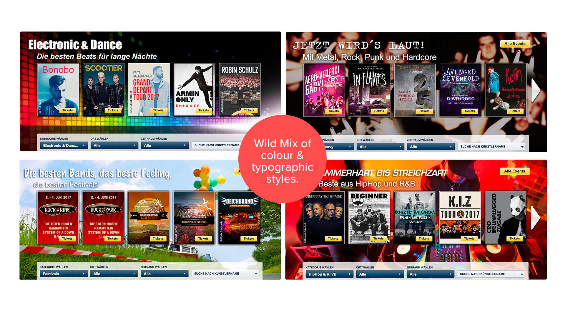
With projects of this scale, I always begin with the Visual Audit. This is where I perform a comprehensive review of the company’s existing design elements across all touchpoints, evaluating their cohesion and effectiveness.
In reality, this means grabbing and screenshotting all the material I can get my hands on. For Eventim, this meant both print and digital touchpoints: apps, websites, blogs, intranet, styleguides, tickets, posters, venue signage, brochures and magazines.
From these initial findings I was then able to begin formulating a plan to improve the user experience and modernise the brand identity.
EVOLUTION STRATEGY
Key steps in the transformation strategy for a modern and forward-looking Eventim brand:
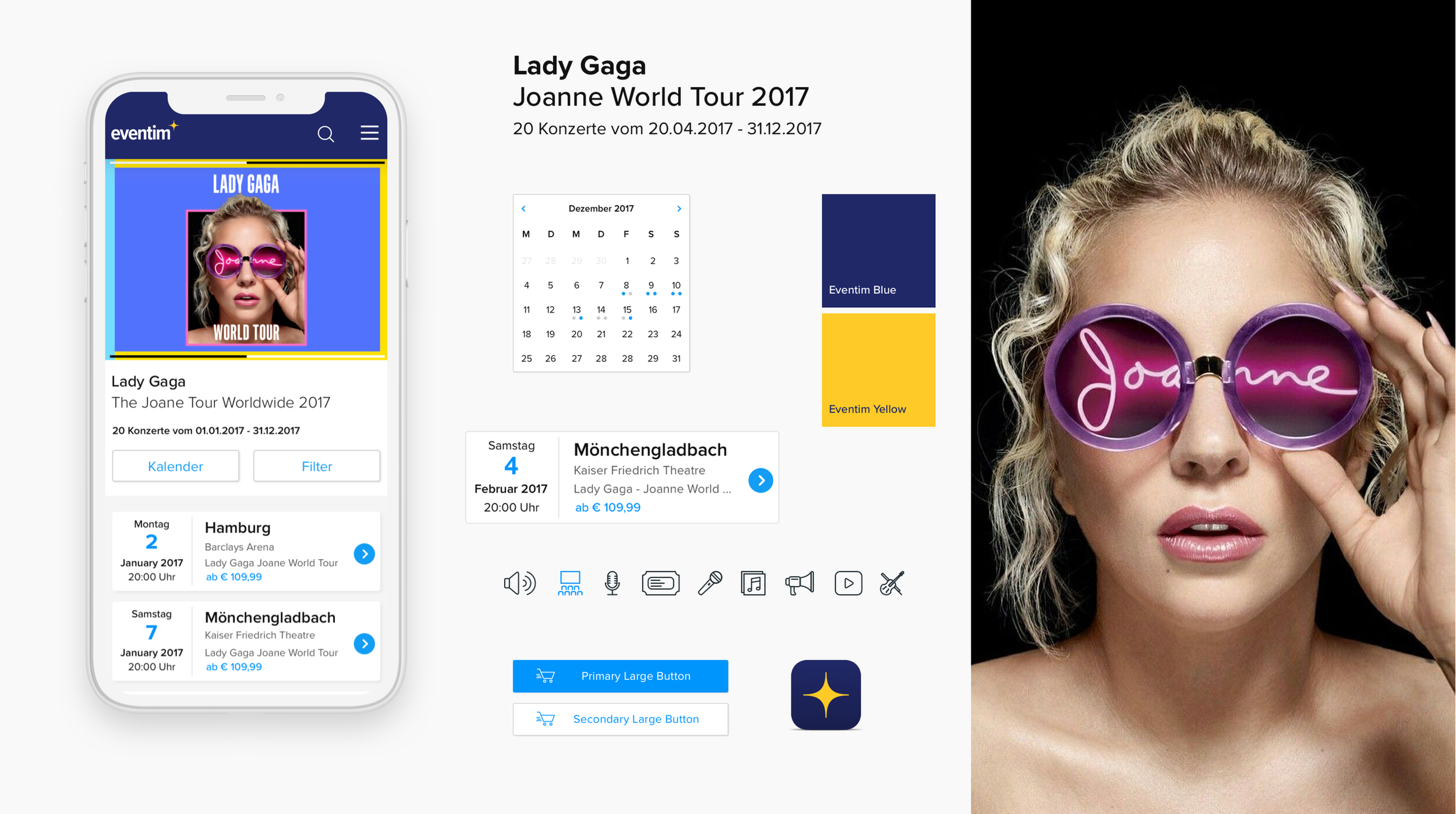
UI/UX Enhancement
I developed the User Interface (UI) and User Experience (UX) strategy for key elements of the Eventim platform, including the homepage, product pages, and artist pages.
Branding Strategy
I formulated a new branding and design strategy for Eventim to create a fresh, modern, and cohesive visual identity.
Typeface Selection
I selected a new house typeface that would unify all Eventim products and materials, ensuring consistency and readability.
Logo Redesign
As part of the process, I redesigned the Eventim logo to align with the new brand identity, simplifying and aiming for a more contemporary look and feel.
Future Vision
I crafted an inspirational ‘Future Vision’ for the platform, envisioning how it could captivate and engage audiences with an exceptional user experience while simultaneously driving revenue and increasing user engagement.

Project Insights.
Some detailed insights into the thinking and concept behind the digital transformation of the Eventim brand.
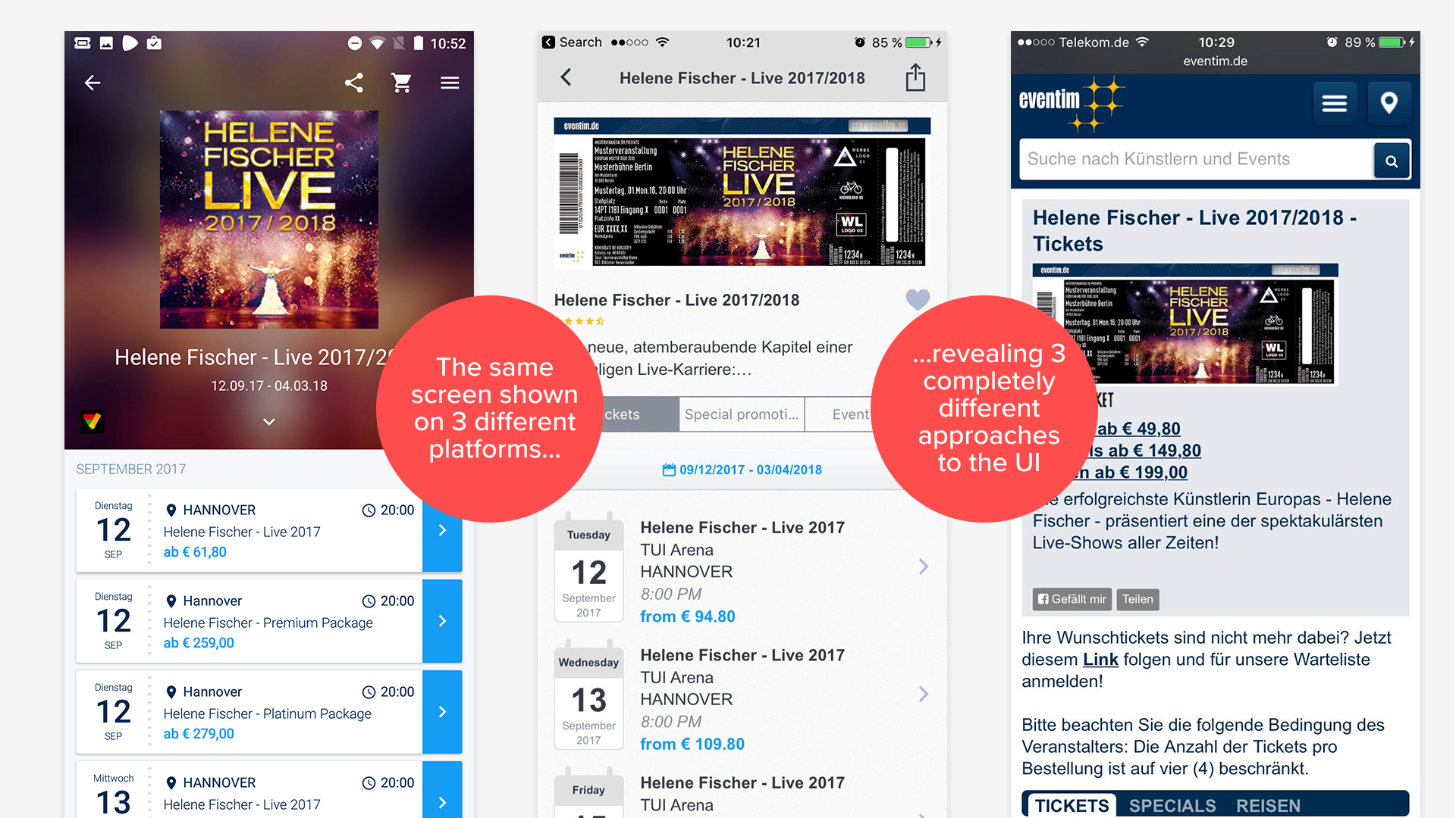
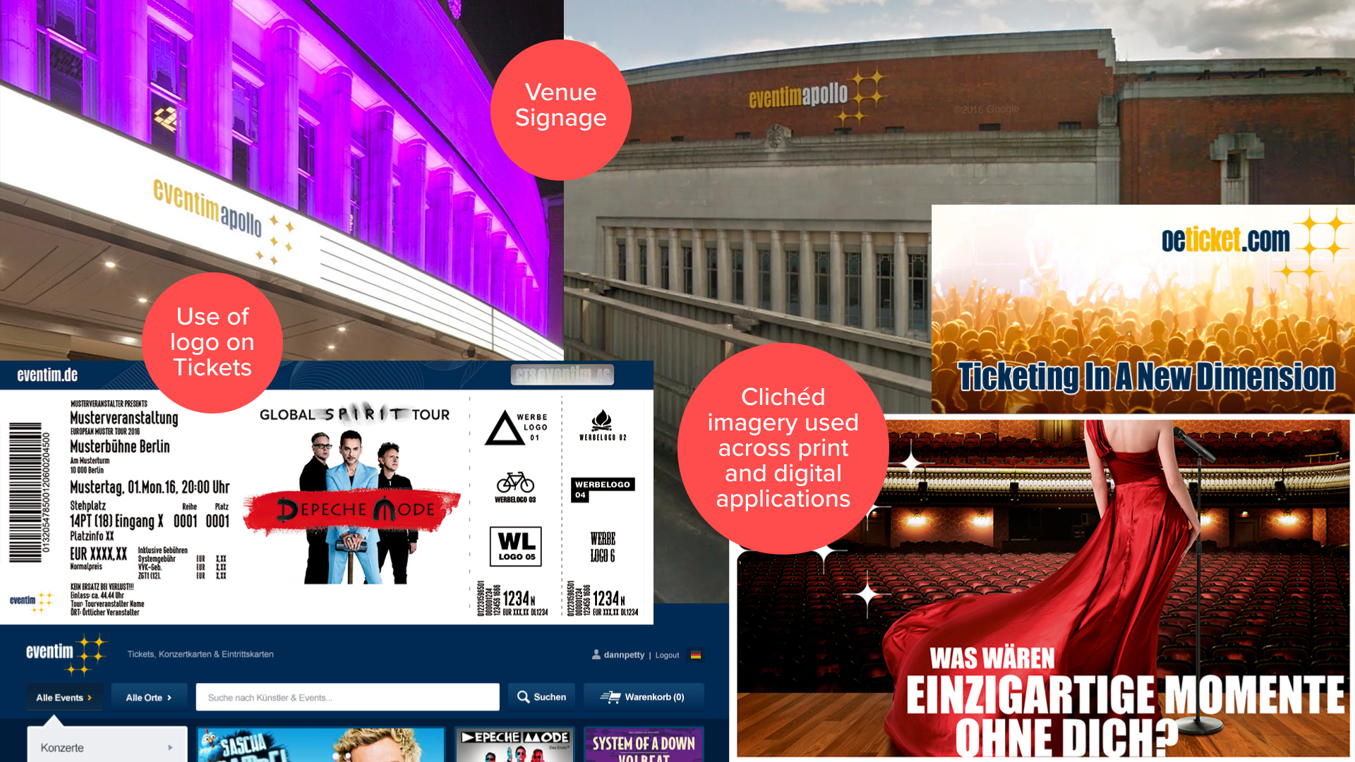
Visual Audit.
The Visual Audit is probably the most revealing part of any large digital transformation process, and usually the most surprised people in the room, when all is said and done, are the clients themselves.
This moment occurs when they view a comprehensive overview of their company's brand design assets for the first time, laid out side by side on a digital whiteboard. The display of the complete inventory reveals all strengths, weaknesses, inconsistencies, and potential areas for improvement.
The audit I conducted for Eventim represented a major undertaking, given the multitude of touchpoints associated with the brand: ranging from apps, websites, and blogs to intranet portals, style guides, tickets, posters, brochures, magazines, and venue signage, to name just a few.
This required a meticulous analysis, evaluation, and documentation process to comprehensively understand the current state of the brand's design language.

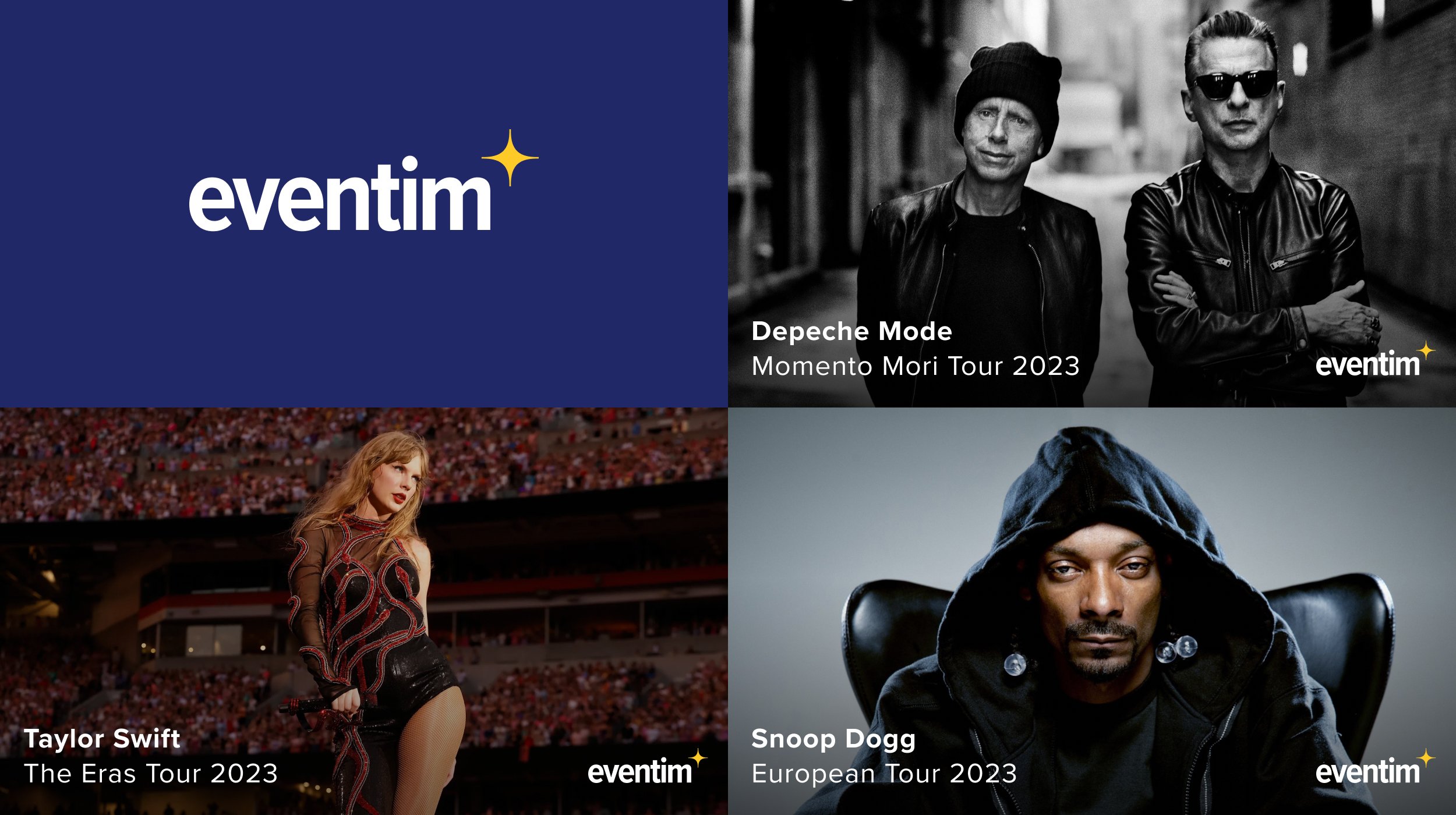
Visual Design.
Modernising Eventim's design language to align with brands like Spotify, Tidal, Apple Music and Songkick was a strategic move that aimed to enhance the user experience and bring a fresh, contemporary feel to the platform.
Through user research, I found that potential customers associated the visual design of a website or platform with its relevance and trustworthiness.
When the overall design feels outdated, users perceive the platform as less relevant, potentially impacting their trust in the service.
By aligning the visual aesthetics with modern entertainment brands like Spotify and Apple Music, I sought to convey a sense of modernity and relevance with the choice of typeface, colour palette, and a clean minimal User Interface.
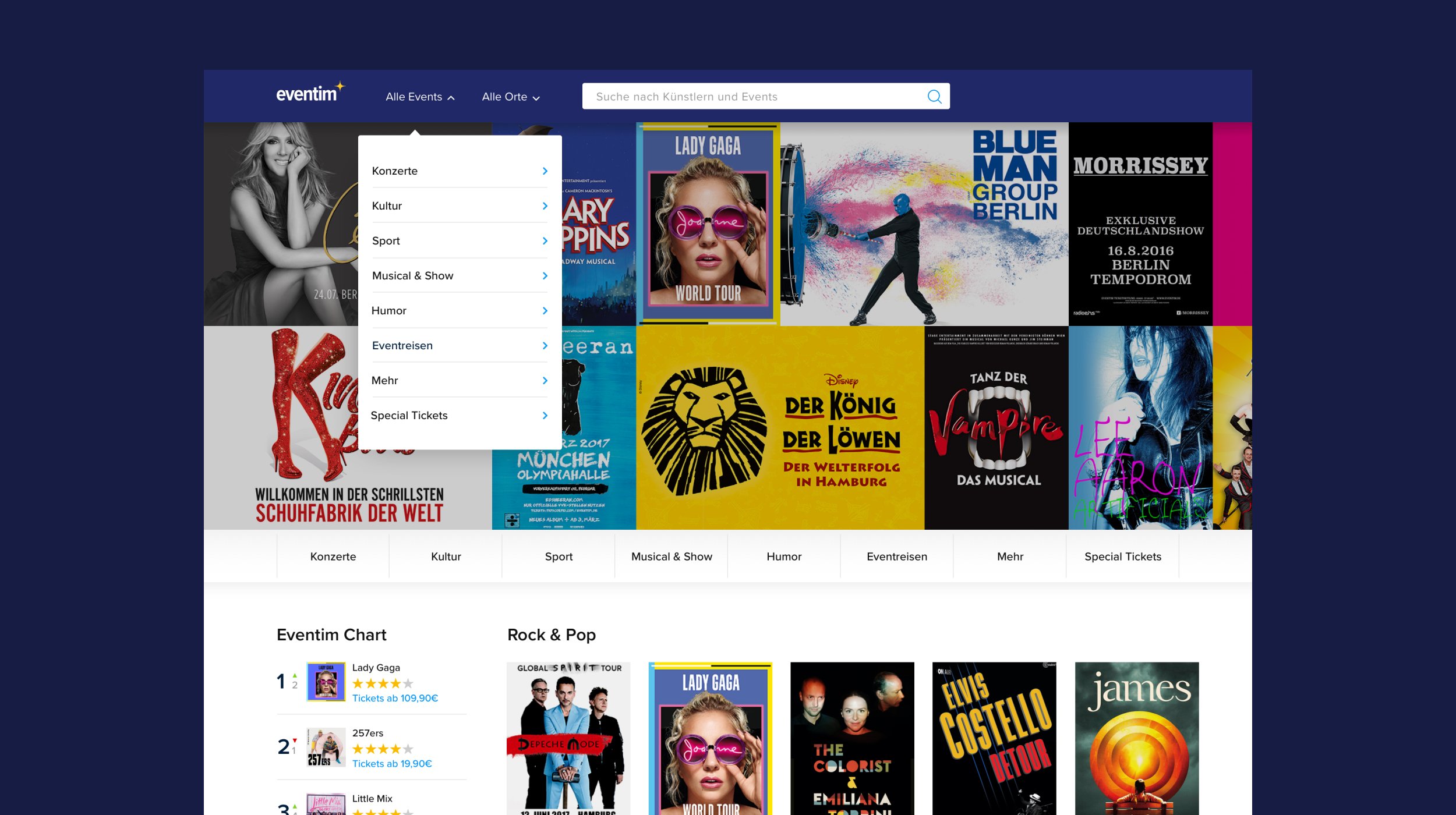
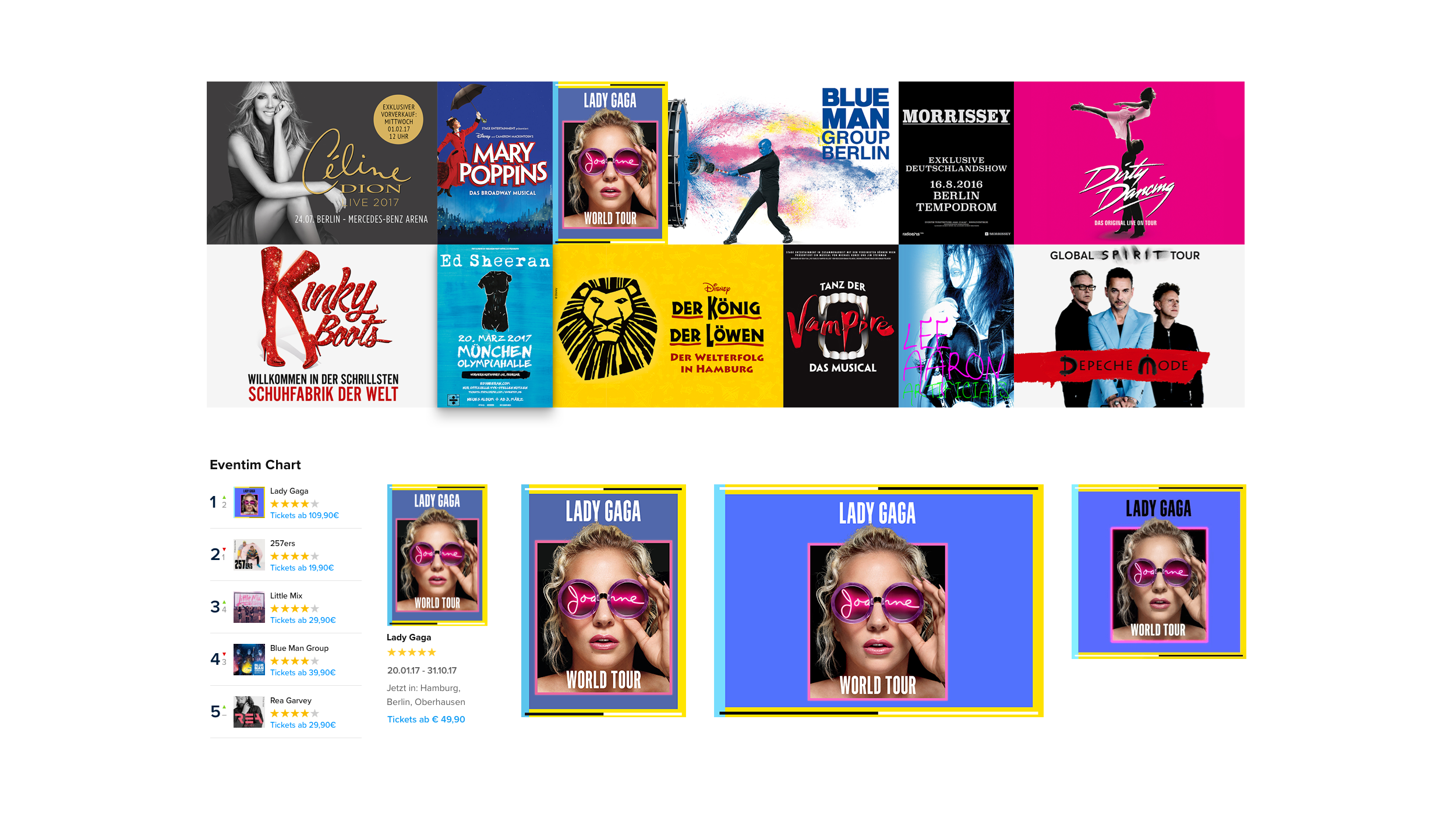
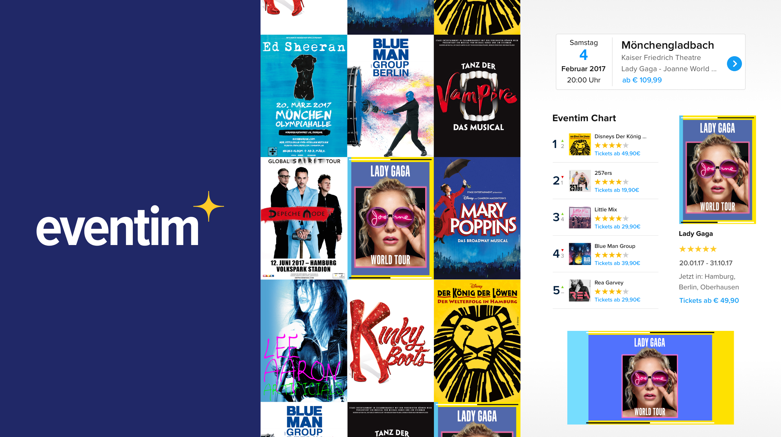
Homepage.
The Eventim homepage is the first port of call for customers who are interested in buying tickets for a concert or event, but perhaps do not have a specific artist in mind.
The established design approach here emulates a classic wall of posters you would encounter in the physical world. Users are invited to discover the biggest upcoming events and to browse what’s currently popular in the various listed genres.
Artist posters are used as a navigational device throughout the platform and this approach aligns with the visual history of the music and live entertainment industry. It is also an established form of navigating the multitude of streaming platforms already out there.
Fans of a particular artist can quickly identify and click on the poster to access relevant event details. This simplifies the navigation process and enhances the user experience.
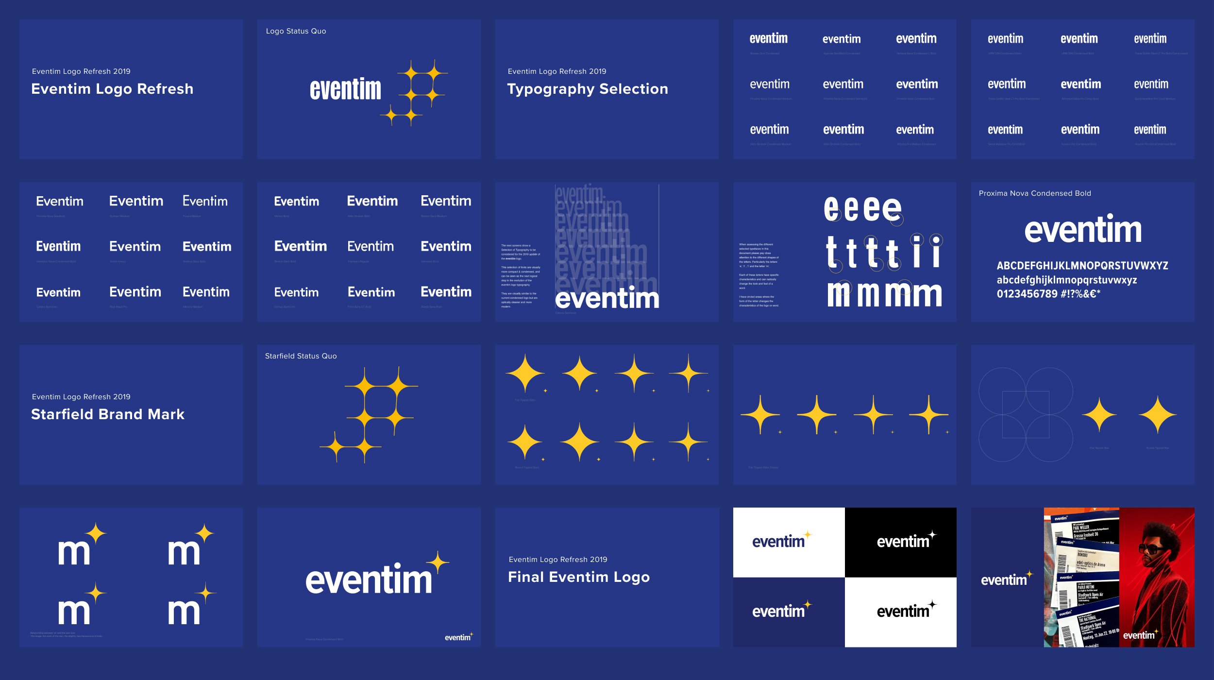
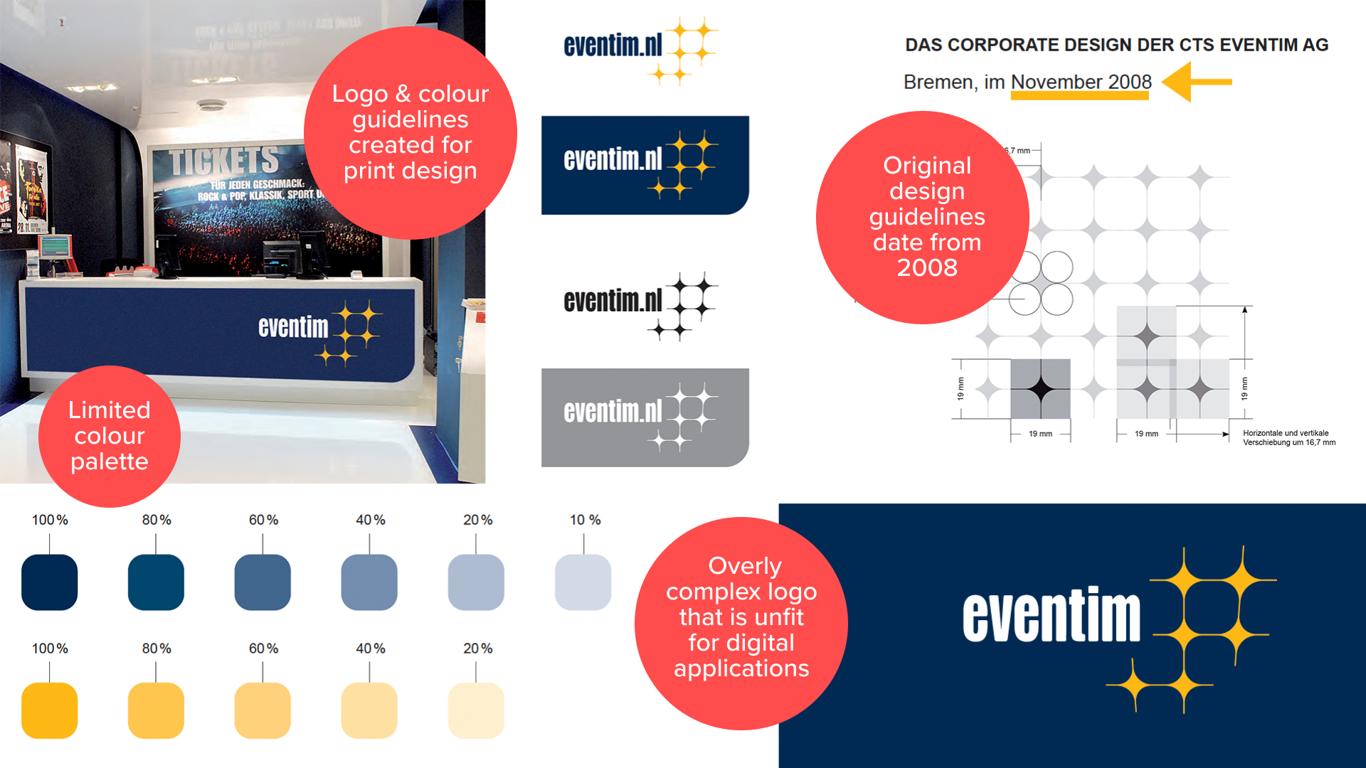
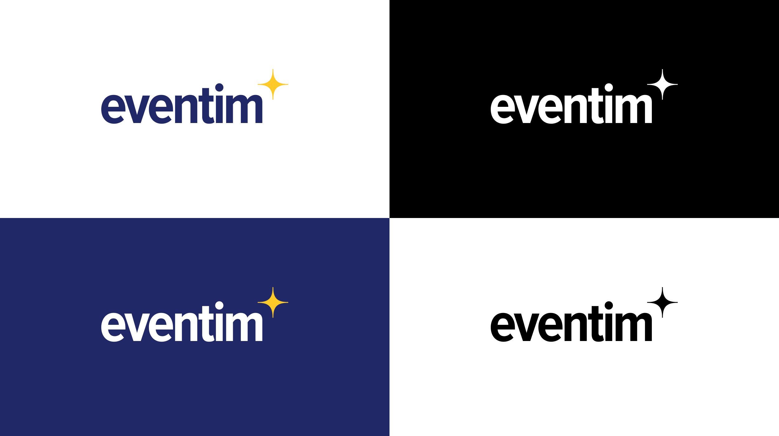
Logo Redesign.
The ‘refresh’ of the Eventim logo was an integral part of the modernisation process.
The original logo was outdated, overly complex, and did not lend itself well for use across digital touchpoints.
With the redesign of the logo, I aimed to clean up and simplify the ‘Starfield’ brandmark, resulting in a simple constructed star shape.
The discovery phase involved testing a wide range of condensed typefaces, which echoed the original highly condensed wordmark, but conveyed a more friendly and modern contemporary look.
The final selection of Proxima Nova Condensed Bold for the wordmark resulted in a compact and modern logo, with the curves of the new star brandmark echoing the shape of the ‘m’ in Eventim.
The new logo typeface and the use of Proxima Nova across all touchpoints create a cohesive and consistent identity.


OUTCOME
Strong growth, record results and ongoing optimisation of the digital platforms and products.
By modernising Eventim's design language and user experience I created consistency in design across all major touchpoints, from the website to the mobile apps, from the physical tickets to the promotional materials and venue signage.
These improvements collectively contribute to a more engaging and user-centric platform, ultimately benefiting Eventim and its audience.